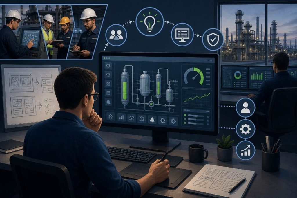
Working with customers across a wide range of industries, we see HMI (Human-Machine Interface) applications in every form, some visually stunning, others purely functional, and a few that strike the right balance between the two. It raises an important question: what truly defines a good HMI design?
We often hear that effective HMI design is built on clarity, consistency, and strong operator situational awareness, helping minimize errors while maximizing efficiency. The best designs are user-centric, with intuitive navigation, thoughtful use of color, logical screen layouts, and well-prioritized alarms that enable operators to quickly interpret and act on complex information.
But what does that really look like in practice?
In this blog, we will explore design principles to make industrial HMI applications more intuitive and user-friendly.
What is the purpose of an HMI?
The purpose of an HMI is to enable clear, efficient interaction between people and machines. It provides intuitive systems and screens that allow users to monitor operations, control processes, and respond to real-time feedback.
Whenever a person uses a visual or digital interface to send a command or receive information, HMI is at work. At its core, an HMI acts as the bridge between humans and machines, translating complex data, actions, and inputs into meaningful insights and straightforward control.
Core HMI functions
Every human-machine interface is ultimately designed to help people see what is happening, take action when needed, and stay in control.
These functions are at the core of effective HMI design:
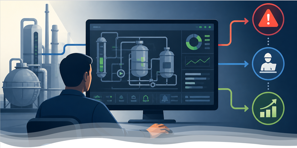
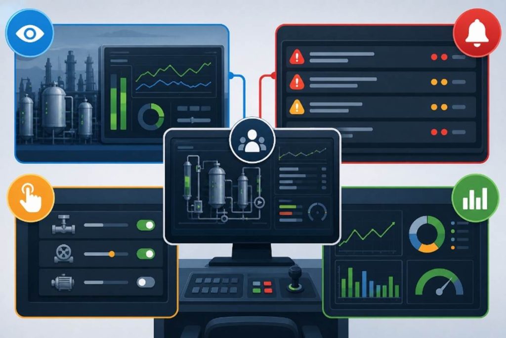
1. Monitoring: Keeping an eye on key processes, metrics, or centralizing data, whether that is machine status or user behavior in an application.
2. Control: Allowing users to start, stop, or adjust parts of the system, like toggling settings or adjusting automation parameters.
3. Alarm and alert management: Notifying users when something goes wrong, from minor warnings to critical system failures. A well-designed alert system prioritizes severity and guides quick action.
4. Performance dashboards: Surfacing KPIs and real-time metrics to help users make informed decisions fast.
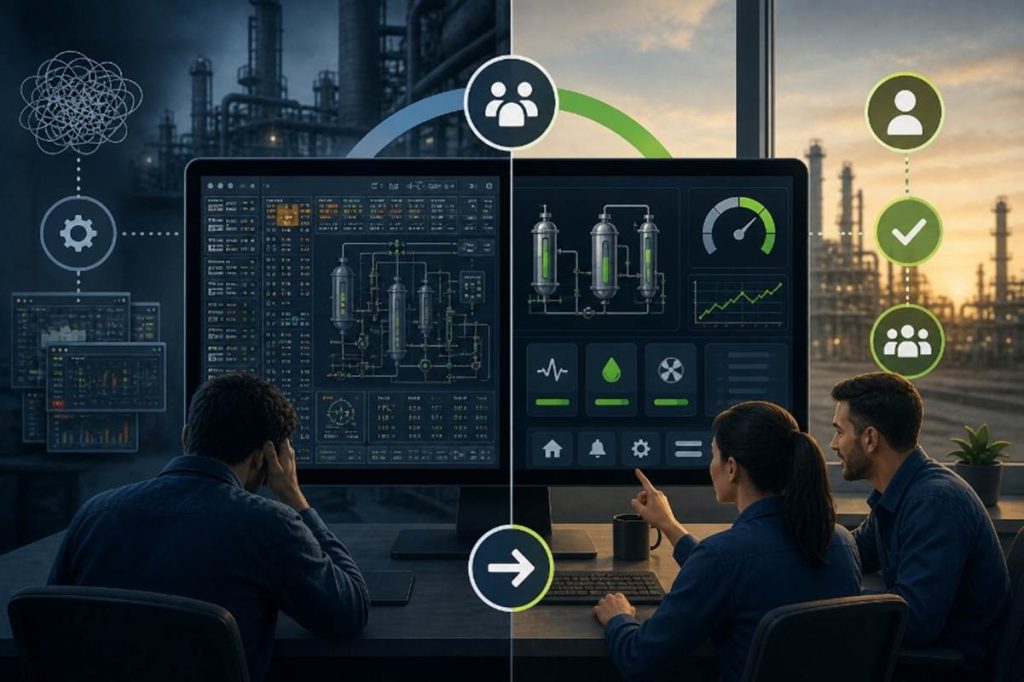
Unnecessary detail distracts users and reduces their ability to recognize critical events. Modern HMI displays prioritize simplicity, focusing attention on what matters most while remaining intuitive, responsive, and aligned with user intent.
HMI Design Principles: Creating Interfaces That Are Intuitive, Clear, and Safe
While specific applications may differ, effective HMI design consistently comes back to a few core principles that guide how users interact with systems:
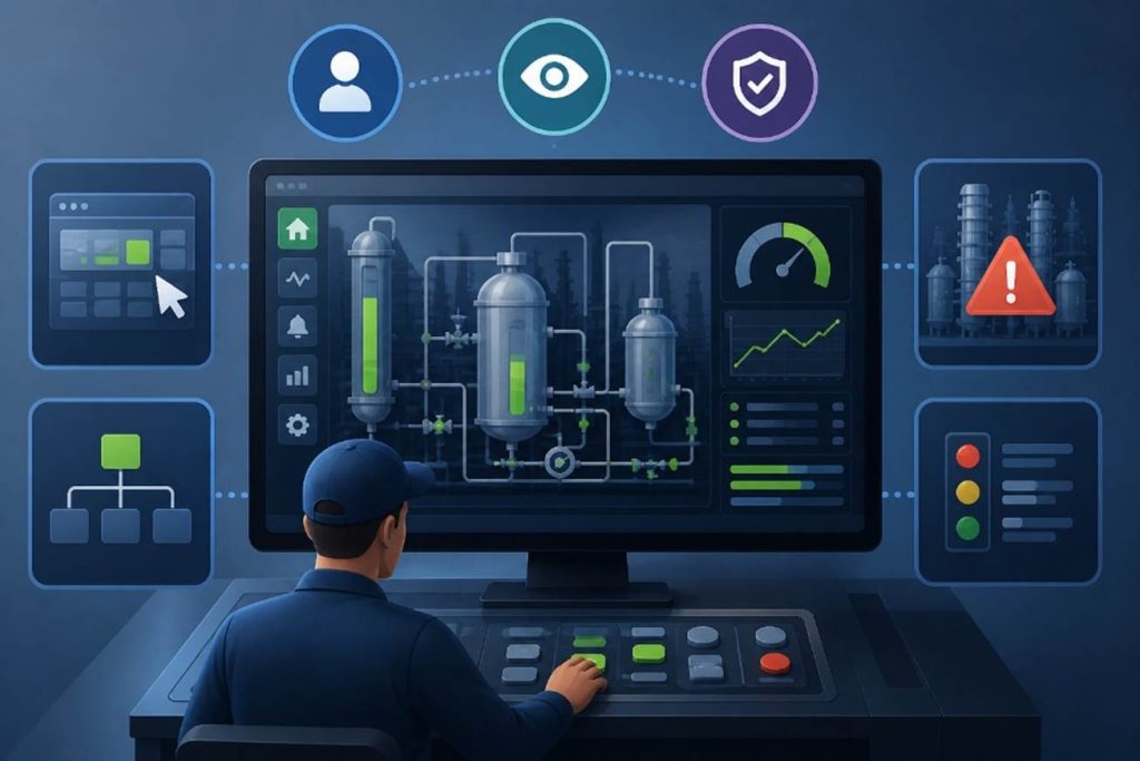
1. Situational Awareness
The interface should enable users to instantly understand what is happening, supporting not just visibility, but the ability to perceive current conditions, interpret their meaning, and anticipate what may happen next. Effective designs reduce information overload by using contextual, high-performance visuals rather than raw data alone, helping users quickly identify deviations from normal operations and make fast, informed decisions.
2. Clarity
Visual elements, labels, and layouts should simplify complex information. The goal is to reduce cognitive load so users can interpret data quickly and accurately.
3. Responsiveness
Every user action should be met with immediate, meaningful feedback. Users need to know their input was received and understand the outcome without hesitation.
With these principles in place, we can begin to see how human psychology and UX design come together, translating into interfaces that feel natural, efficient, and effortless to use.
What Makes a Great HMI Designer? Insights from the Field
At ADISRA, we actively seek feedback not only from our customers but also from the broader industrial automation community. When we came across a discussion among automation engineers on what makes a great HMI designer, we found the insights both practical and refreshingly honest. We have summarized and incorporated some of their best advice here.
Clarity Above All
A well-designed HMI should be so clear and intuitive that operators never have to stop and think about what an action will do. Labels, controls, and system feedback should be immediately understandable.
Use the Right Language: Verbs vs. States
Clear terminology is critical:
- Commands (Verbs): Start, Stop, Open, Close
- States (Statuses): Running, Stopped, Opened, Closed
- Transitions: Starting, Stopping, Opening, Closing
For example, a motor might use Start/Stop to move between Running/Stopped, with transitional states displayed when relevant. For slower processes, like large fans, it is helpful to show these transitions. For fast actions, it may not be necessary.
Be thoughtful with terms like On/Off, which can be ambiguous. Often, it is clearer to use more descriptive states such as Heating/Idle or Cooling/Active. If additional logic is involved, Enable/Disable may be more appropriate.
Consistency also matters, especially for fault conditions. Standardizing terms like Failed across the system helps operators quickly recognize and respond, rather than having to interpret variations such as Fault, Trip, or Unavailable.
Design for Focus, Not Distraction
Good HMI design minimizes unnecessary visual noise:
- Avoid excessive animation or moving objects; they distract more than they inform.
- Limit flashing elements; if everything is blinking, nothing stands out.
- Use color intentionally; do not rely on a full spectrum when a restrained palette is more effective.
Modern high-performance HMI design often starts with a grayscale foundation, using color and motion sparingly, primarily to highlight abnormal conditions or alarms. This approach has been shown to improve operator response and reduce the risk of overlooking critical events.
However, context matters. In some plant environments, the selective use of color can enhance clarity rather than detract from it. For example, on smaller touch panels used occasionally for simple tasks, like adjusting a setpoint, color can provide helpful visual guidance. Likewise, in processes involving multiple materials or flows, such as systems with multiple fluids, a purely grayscale display may hinder usability. In these cases, thoughtfully applied color can help operators quickly distinguish between elements and better understand the process at a glance.
As one engineer put it: “If everything is blinking, nothing is.” Another added: “If you optimize for everything, you optimize for nothing.”
Make Critical Events Stand Out
There should be a clear hierarchy of attention. Only the most critical conditions, such as safety hazards, should trigger strong visual or audible alerts. When something blinks, flashes, or announces itself, it should mean immediate action is required.
Keep It Simple
As one engineer put it, “HMI design is like a good joke. If it needs explanation, it’s not working.”
The main (home) screen should provide a clear, high-level overview of the system, allowing operators to assess status at a glance. More detailed engineering information, such as formulas, tuning parameters, or advanced controls, should be accessible on secondary screens rather than cluttering the primary interface.
Equally important is standardization. The colors, symbols, and visual cues used to represent alarms or abnormal conditions should be consistent across the organization, ensuring operators can recognize and respond quickly without confusion.
These real-world perspectives reinforce a simple truth: great HMI design is not about adding more; it is about showing less, more effectively.
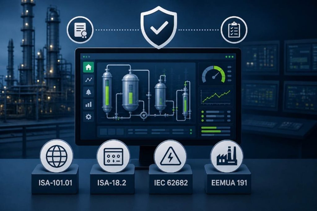
Standards
Following established standards is always a best practice, and in HMI design, two stand out: ISA-101.01 for HMI design and ISA-18.2 for alarm management. Both provide valuable guidance for building effective, consistent, and operator-focused systems.
That said, standards should guide, not dictate, your design. An HMI should adapt to the operator, not the other way around. Ultimately, it is not about the system itself, but about the people using it.
The ISA-101 standard was developed to improve the design, deployment, and maintenance of HMIs, shifting the focus from simply displaying data to delivering meaningful context. Its goal is to help operators quickly perceive, understand, and anticipate system behavior, reducing risk and improving decision-making.
The initiative began in 2003, when the International Society of Automation brought together end users, operators, and engineers to define best practices. After more than a decade of collaboration, the standard was formally published in 2015 as a comprehensive set of principles for developing effective process HMI graphics.
At its core, ISA-101 promotes interfaces that are:
- More functional
- Easier to understand
- Driven by information, not just data
Key concepts include:
- User-Centered Design
Focused on reducing cognitive load and preventing “running by the alarms”, a reactive mode of operation where operators rely on alarms instead of proactively monitoring the process.
- Hierarchical Screen Structure
A layered approach that typically includes:
Level 1: High-level system or plant overview
Level 2–4: Increasing levels of detail for areas, units, and diagnostics
This structure allows operators to move quickly from overview to root cause without being overwhelmed.
- High-Performance Graphics
Simplified, muted visuals, often grayscale, so that abnormal conditions stand out clearly.
- Contextual Information
Moving beyond raw numbers to include trends, relationships, and context, enabling faster diagnosis and better decisions.
ISA-18.2 and Alarm Management Standards
While ISA-101 focuses on visualization, ISA-18.2 addresses alarm management. It provides a lifecycle framework for designing, implementing, and maintaining effective alarm systems in process industries.
One key guideline is alarm rate: ideally, an operator should not face more than two alarms every 10 minutes. In reality, many systems exceed this significantly, leading to alarm fatigue and increased risk.
Additional standards reinforce these best practices:
An international standard aligned with ISA-18.2, providing guidance for alarm system design, monitoring, and continuous improvement to prevent operator overload and hazardous situations.
A widely adopted guideline focused on alarm rationalization, prioritization, and performance. It recommends sustainable alarm rates (often around 6 alarms per hour) and emphasizes continuous monitoring to improve safety and operational efficiency.
Together, these standards reinforce a common theme: effective HMI design is not just about displaying information, it is about delivering the right information, at the right time, in a way that enables operators to act with confidence.
Conclusion: Designing for People, Not Just Systems
As HMI design continues to evolve, we find ourselves balancing two important forces: the push to make systems so intuitive that anyone can use them, and the need to maintain clear, logical, and highly effective operator interfaces. Add to that a growing emphasis on human factors, ergonomics, real-time decision-making, Artificial Intelligence (AI), and it becomes clear that great HMI design is both an art and a discipline.
At the same time, technologies such as 3D graphics, augmented reality (AR), and virtual reality (VR) are opening new possibilities in HMI design. The question is not whether they belong, but where and when they truly add value. In many cases, simplicity and clarity remain the priority. However, in areas like training, simulation, or complex spatial visualization, the ability to mentally interpret, rotate, and understand multi-dimensional systems, these technologies can enhance comprehension and improve outcomes when applied thoughtfully.
Ultimately, the goal remains the same: design systems that help people do their jobs better, faster, and safer.
With platforms like ADISRA SmartView, you can build modern HMI/SCADA applications that align with these principles, combining intuitive design, high-performance visualization, and the flexibility to adapt to evolving technologies and user needs.
Ready to see it in action? Download a trial of ADISRA SmartView and start building today.

We would like to hear from you.
How do you see the role of 3D, AR, or VR in the future of HMI design?
Share your thoughts in the comments or reach out to us at info@adisra.com.
Join us for our next ADISRA webinar on May 7th at 9:30 AM CDT.
Find more details and register below.

Design for Productivity: Advanced Features in ADISRA SmartView
Designing modern HMI/SCADA applications is no longer just about connecting data and building screens; it is about delivering scalable, intelligent systems quickly and efficiently.
In this webinar, we will explore how ADISRA SmartView’s architecture and advanced design features enable developers to significantly improve productivity and build more flexible, powerful applications.
We will begin with a high-level overview of the ADISRA SmartView architecture to help you understand the foundation that supports real-time data processing, modular design, and cross-platform deployment. From there, we’ll dive into the advanced features that allow you to design smarter, not harder.
You will learn how to:
– Reduce engineering time through reusable design strategies
– Build scalable applications using structured data models
– Implement intelligent logic without complex coding
– Make real-time changes without stopping your system
Whether you are a system integrator, OEM, or end user, this session will show you how to move beyond traditional development approaches to build high-performance, maintainable applications with speed and confidence.
ADISRA’s webinar is scheduled for May 7, 2026
Global Time Zones – Start Time:
7:30 AM PDT
9:30 AM CDT (Austin, Texas)
10:30 AM EDT/COT
2:30 PM UTC (Coordinated Universal Time)
4:30 PM CEST
5:30 PM EEST/SAST
9:30 PM WIB
10:30 PM SGT
You can register for the webinar here.
ADISRA®, ADISRA’S logo, InsightView®, and KnowledgeView® are registered trademarks of ADISRA, LLC.
© 2026 ADISRA, LLC. All Rights Reserved.